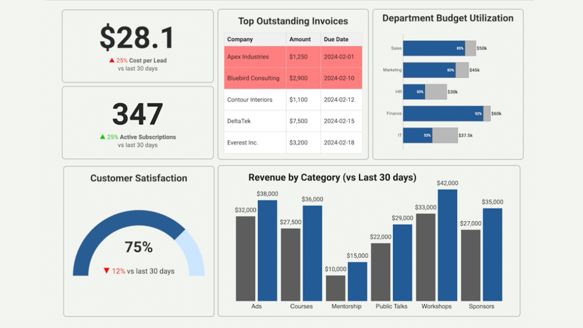
Dashboards That Actually Get Used
A guide to solving a common pain point
March 24, 2025 • 5 min read
Yep. Despite good intentions, dashboards often wind up ignored, gathering digital dust in a forgotten corner of your analytics platform.
So what's going wrong here?
The truth (and it's a little uncomfortable to admit) is that dashboards often fail not because of a lack of effort, but because they just aren't engaging, clear, or useful enough. They're simply not doing their job effectively: communicating information clearly and compellingly to help real people make better decisions.
Here are a few things that can help.
Principle #1: Keep it Simple. Nobody Likes Dashboard Overload
Think about dashboards you've personally stopped visiting. Most likely, they were cluttered and overwhelming. Too many visuals, noisy colors, and redundant information. You'd open them once, feel instant anxiety, and then leave forever.
Your users feel the same way.
A few ways to fix this:
- Remove Distractions. Strip out unnecessary borders, decorations, and excess labeling. Every pixel should earn its place.
- Whitespace is your friend. Give visuals breathing room and intentionally guide your user’s eye toward the most important insights.
- Easy on the colors. Use color sparingly and intentionally, highlighting only critical information or alerts.
The simpler your dashboard feels, the more likely people are to actually use it.
Principle #2: Provide Meaningful Context. Numbers Alone Don't Tell the Story
Numbers on their own can be difficult to understand. If someone looks at a metric and can't quickly make sense of what it means, they'll just stop checking. Adding context around how to interpret the number can make all the difference.
To stop this from happening:
- Benchmark your data. Add comparisons to historical periods, industry averages, or peer performance.
- Clearly define goals and targets. Make it immediately obvious if metrics are on track, smashing expectations, or in the danger zone.
- Explain what's happening. Don't leave your user guessing. Provide helpful annotations or brief explanations of why something matters, not just what the number is.
Principle #3: Align with Your Users' Actual Workflow
Dashboards often get built around what's convenient for the data team rather than what's natural for users. If people can't quickly find the information they actually care about, they're gone in seconds.
Here’s how to fix that:
- Start high level, then drill down. Put key insights and KPIs front and center, then gradually introduce details.
- Group information intuitively. A common mistake I often see is grouping things by data source. It makes more sense to group by how your users actually work. Think campaigns, product categories, regions, whatever makes sense for their daily workflow.
- Stay consistent. Using a consistent visual style across your dashboards helps users grasp insights without having to relearn how to read each new page. Consistency builds familiarity and trust.
A thoughtfully structured dashboard quickly becomes the go-to tool users love and rely on daily.
Dashboard Sanity Check: Before You Hit 'Publish' Ask Yourself...
- Is it instantly clear what's most important? If a user opened this dashboard for just five seconds, would they understand what’s happening, what’s going well, and what’s concerning?
- Is everything actionable? Every number or visual on your dashboard should drive some form of action or decision.
- Did you include enough context? Have you provided benchmarks, historical comparisons, or explanations that help users instantly grasp why the numbers matter?
- Is the layout intuitive for your users (not just you)? Step back and view the dashboard from your users' perspective. Better yet, get their feedback. Does it align with how they naturally seek information?
- Is it visually calm and focused? Eliminate any unnecessary clutter. Remember, a cleaner dashboard isn't just prettier. It's easier and faster to use.
Getting dashboards right takes some effort, but it's worth it. When your audience can actually find what they need and understand what they're looking at, that forgotten dashboard becomes something your team uses every single day.