Waffling AI Citations
How Bad Are AI Search Engine Citations?
March 30, 2025 • 2 min read
Credit: Tow Center for Digital Journalism at Columbia's Graduate School of Journalism
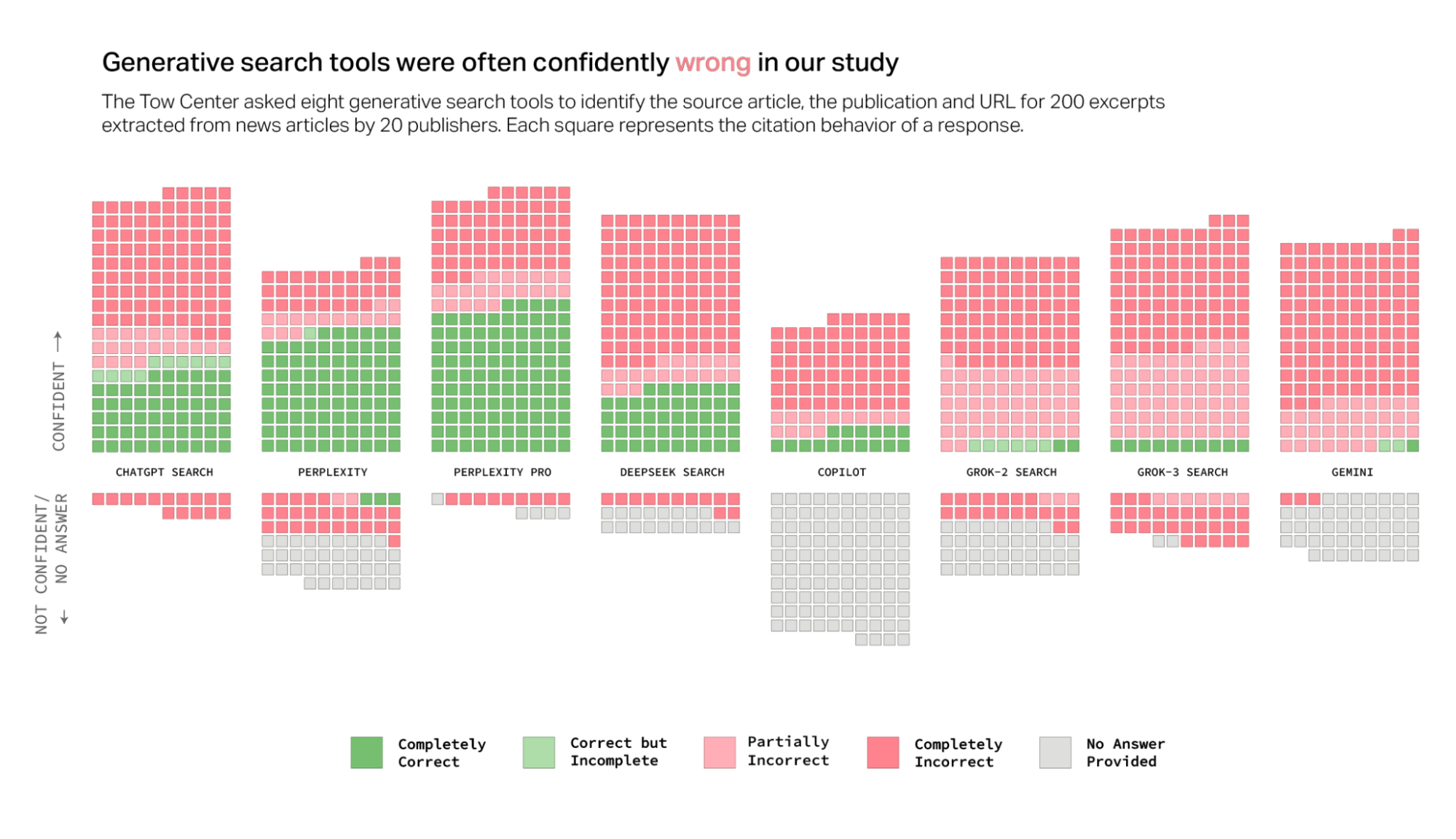
AI-powered search engines often talk a big game, confidently serving up quick answers to our queries. But in an experiment run by Tow Center for Digital Journalism at Columbia's Graduate School of Journalism, these waffle charts illustrate, their citations tell a different—and troubling—story.
AI-powered search engines often talk a big game, confidently serving up quick answers to our queries. But in an experiment run by Tow Center for Digital Journalism at Columbia's Graduate School of Journalism, these waffle charts illustrate, their citations tell a different—and troubling—story.
Each tiny square here represents an attempt by an AI search tool to correctly identify and cite the source of news articles. A quick glance reveals a lot more pink and grey squares than green ones, and that’s not good. Tools like Grok-3 and Gemini are confidently incorrect more often than not, creating a visual wall of misinformation.
What's particularly striking is how visually clear waffle charts make this story: you can instantly see where each tool falls short. Unlike pie charts, which can make these differences hard to spot, waffle charts let you easily grasp just how widespread the citation problems are—no guessing required.
If you're curious why waffle charts tell this story better than pie charts (and why I'm a big waffle chart fan!), check out our video diving into Pie Charts vs. Waffle Charts. Spoiler alert: Waffles usually win.
In the meantime, these visuals remind us that while AI might be smart, there's still a lot it needs to learn about giving credit where credit’s due.