Two Panel Chart Design
Why Color Choices Matter
November 19, 2025 • 3 min read
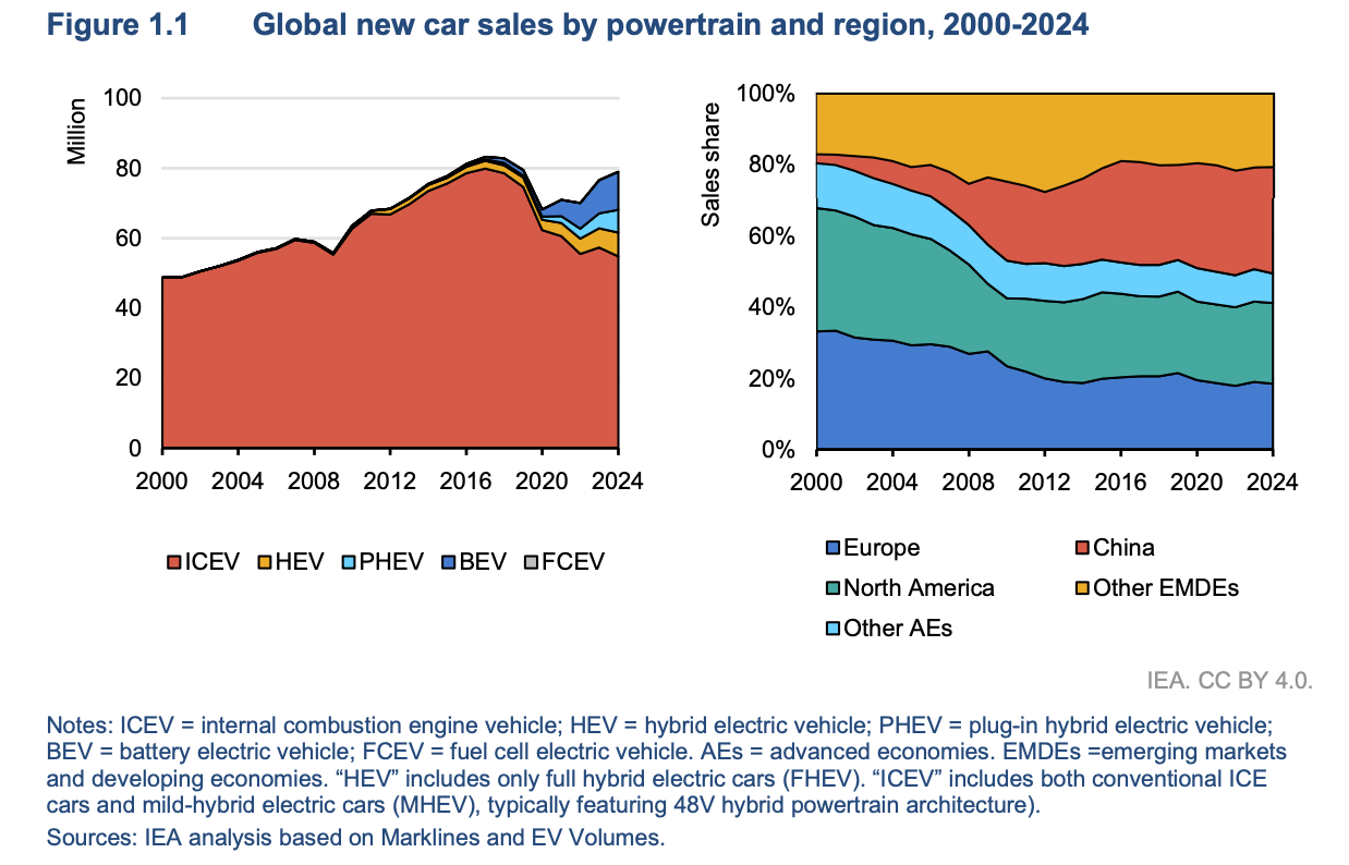
This visual does a lot right. It tackles two different questions at once using a two panel layout. Left panel shows global car sales by powertrain type from 2000 to 2024. Right panel shows who's buying the cars by region.
...But there's one issue that trips up the message.
Left panel: Red = ICEVs (internal combustion engine vehicles).
Right panel: Red = China.
See the problem?
Those meanings have nothing to do with each other. But our eyes don't know that. We're wired to assume matching colors mean matching concepts. The big block on the left and the big layer on the right seem connected. Same with the rest of the colors.
Sure, if you slow down and read the legends, you can untangle it. But the initial confusion is there...
Here's the fix.
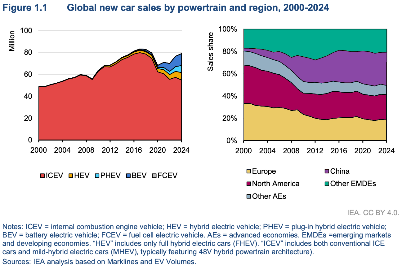
I picked a distinct palette for the regional panel here. It doesn't necessarily match the original design style perfectly, but you could easily adjust it to fit. With the fix, it's very clear at first glance that these charts are separate parts of the story.
In a side-by-side panel view, color decides what belongs together and what stays separate. You can (and should!) use the same color across charts if you're talking about the same category, but using the same color for 2 different purposes isn't best practice when it's side-by-side. If you really need to use the exact same color palette across charts, make them under completely separate figures so there's less confusion.