Spain's Fiscal Profiles
The Age Groups Paying In vs. Taking Out
December 22, 2025 • 3 min read
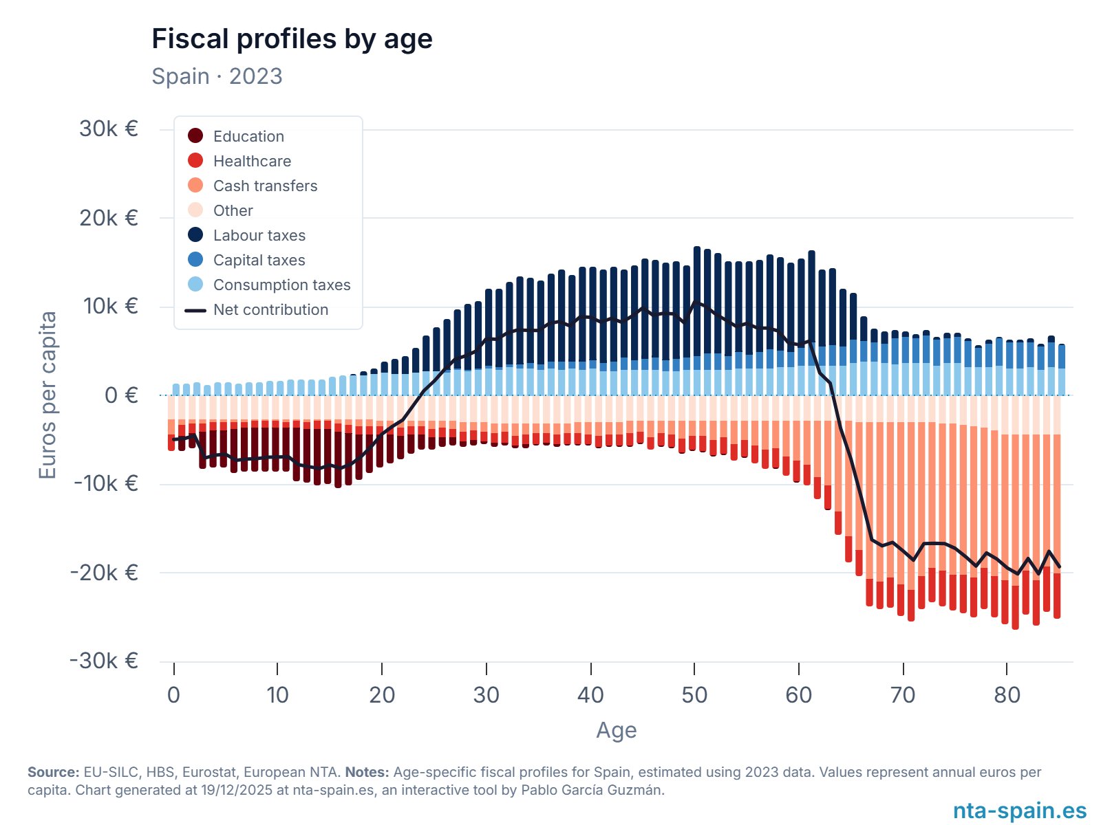
Chart by Pablo García Guzmán via NTA-Spain
Source: NTA-Spain (National Transfer Accounts) →
I came across this chart from Pablo Guzmán's Spain tool that visualizes how much the government spends on you versus how much you pay in taxes, broken down by age.
- Blue bars above zero show taxes paid (split into labour, capital, and consumption taxes)
- Red bars below zero show public spending received (education, healthcare, cash transfers, other)
- Black line shows the net fiscal contribution (taxes minus benefits), in annual euros per person, by single year of age
For children, the deficit is dominated by education spending. From roughly the late 20s through the late 50s, the profile turns strongly positive, with labour taxes doing most of the work.
After 60, what's interesting is that healthcare is NOT the biggest contributor to the deficit. Instead, it's cash transfers like pensions that dominate, pulling the net contribution line sharply negative.
A couple things that make the design strong for me...
Color as Mental Model
Using blue for taxes and red for spending creates an intuitive mental model. We're used to seeing red as outflows or costs and blue as inflows or contributions. It mirrors financial statements where expenses are red and revenues are blue (remember this is the government’s point of view).
Using lighter shades within each color family to show different categories keeps the visual hierarchy clean.
Your eye can still separate taxes from spending at a glance, but you can dig into the subcategories if you want.
The Net Contribution Line Does the Math
Notice how zero sits right in the middle of the chart. The chart could have easily stacked the raw numbers, but it cleverly makes spending received negative values.
This lets zero act as the natural visual dividing line between net contributors and net recipients.
Stacked bars are great for showing composition. But they make it hard to answer the most important question: "Am I giving more than I'm getting?"
The black line cuts through all the complexity and does the math for you so you can focus on the answer instantly. Positive means you're a net contributor. Negative means you're a net recipient.