Social Media Usage
When Small Multiples Beat a Single Chart
October 14, 2025 • 1 min read
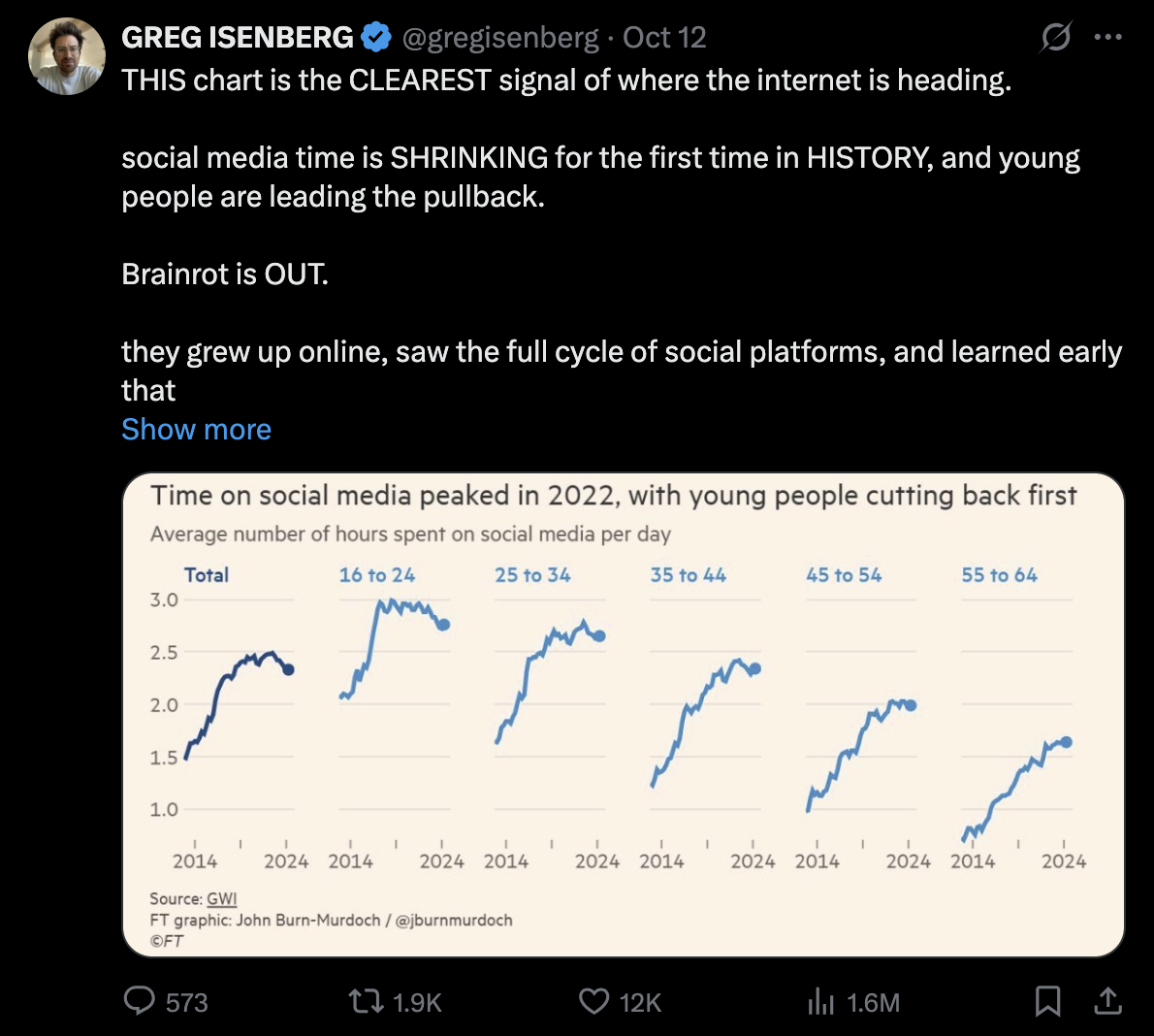
This data is really interesting. Social media use peaked in 2022 at just under 2.5 hours per day globally. The youngest users (16-24) hit 3 hours per day, then pulled back fast. Meanwhile, the 55-64 group kept climbing.
The color system is Cleeaaan...
Each age-panel is light blue, the total is dark blue. That single contrast creates a reading order: start big, then scan the parts. It’s part-to-whole, but without stacking or grouping compromises.
We actually covered this back in July and recorded a quick explainer. The idea is simple: when you multiply out categories into separate charts, you free up visual bandwidth. Watch the video on small multiples →
One more detail that matters: consistent scales. Because every panel shares the same axes, a steep line means the same thing everywhere. REALLY IMPORTANT. If the scales were different, a steep line in one panel might represent less change than a shallow line in another. You would need to check the numbers constantly and it could be misleading.