Controlling the Narrative
How Charts are used to Mislead You
February 24, 2026 • 6 min read
Charts are persuasive because they look objective. A clean look and neat labels can make an argument feel like a fact. That’s why charts are one of the easiest tools to weaponize for a narrative...
I want to walk you through five charts that were shared widely on social media and news outlets.
For each one I'll show you the original chart, what's going on with the design, and why it changes what you take away from it.
1. Cherry Picking
When Google launched Gemini Ultra, it shared this chart part of its media release. Gemini 90.0% vs GPT-4 86.4% on the MMLU benchmark which is one of the big AI benchmarks
![[object Object]](/_next/image?url=%2Fblogs%2Fmisleading-news-charts%2Fgoogle-gemini-claim-to-outperform-gpt-4-5-shot-v0-oklh1y4n7q4c1.webp&w=3840&q=75&dpl=dpl_DZJ2dWiYUahGpNAVgPXFoje8TdQY)
Now read the fine print at the bottom left.
Gemini's score says CoT@32. GPT-4's says 5-shot.
CoT@32 gives the model 32 examples and lets it reason step by step before answering. 5-shot only gives it 5 examples and asks for a direct answer. CoT@32 is a much easier setup for the model to score well on.
So Gemini got the easier setup and GPT-4 got the harder one. Both scores end up on the same chart and unless you know what those labels mean, you'd have no reason to question it.
@_philschmid added what Google left out. When you run Gemini on that same 5-shot setting? It scores 83.7%. GPT-4 actually wins.
![[object Object]](/_next/image?url=%2Fblogs%2Fmisleading-news-charts%2FGArY227XQAoBJzF.jpeg&w=3840&q=75&dpl=dpl_DZJ2dWiYUahGpNAVgPXFoje8TdQY)
The takeaway: “Model A beat Model B” is meaningless until you check whether the comparison is apples-to-apples.
2. Lack of Historical Context
One of the most famous examples of a selective data window comes from the climate debate. In the early 2010s, many news outlets were running the same story: global warming had stopped. The Daily Mail put it plainly: "Global warming stopped 16 years ago." And they had a chart to prove it, starting from 1997.
![[object Object]](/_next/image?url=%2Fblogs%2Fmisleading-news-charts%2Farticle-2217286-157E3ADF000005DC-561_644x358.jpg&w=3840&q=75&dpl=dpl_DZJ2dWiYUahGpNAVgPXFoje8TdQY)
That wasn't a coincidence. 1997-1998 was the peak of one of the strongest El Niño events in recorded history. El Niño causes the ocean to temporarily release heat, which spiked global temperatures that year. 1998 was a statistical outlier.
Start your chart at the highest point you can find and everything after looks flat. The warming trend hadn't stopped. The starting point was just dishonest.
The gif below shows what happens when you zoom out. The long-term warming trend is steady and unmistakable. The "pause" only exists in the narrow window someone chose to show you.
![[object Object]](/_next/image?url=%2Fblogs%2Fmisleading-news-charts%2FGlobal_warming_hiatus.gif&w=3840&q=75&dpl=dpl_DZJ2dWiYUahGpNAVgPXFoje8TdQY)
The takeaway: A single chart only shows you the slice someone chose. Before accepting the story, compare multiple sources and time ranges.
3. Axis Truncation
This manipulation technique is a classic. The White House posted this chart celebrating U.S. steel production increases, comparing 2024 to 2025.
![[object Object]](/_next/image?url=%2Fblogs%2Fmisleading-news-charts%2Faxis-truncation.jpeg&w=3840&q=75&dpl=dpl_DZJ2dWiYUahGpNAVgPXFoje8TdQY)
At first glance, the green bar looks roughly twice the size of the red one. You think Steel production is booming.
But look at the y-axis. It starts at 80.2 million tonnes and goes up to 81.8 million tonnes. The actual difference? 80.9 vs 81.8. That's about a 1.1% increase. Not nothing, but definitely not the dramatic surge the chart is selling you.
@Nucular314 fixed it in the replies by simply starting the axis at zero. And now you can really see how the story changes completely.
![[object Object]](/_next/image?url=%2Fblogs%2Fmisleading-news-charts%2Faxis-truncation-fixed.jpeg&w=3840&q=75&dpl=dpl_DZJ2dWiYUahGpNAVgPXFoje8TdQY)
With a zero baseline, the two bars are nearly identical. The increase is real, but visually it looks like a completely different picture.
If this looks familiar, it's because we see this constantly. AI companies do the exact same thing when launching new models. I wrote about this when Anthropic launched Claude Opus 4.5 and their benchmark chart used a truncated axis to make an 8.6% improvement look like a 2x jump.
The takeaway: If the y-axis doesn’t start at zero, small differences can look dramatic.
4. Dual Y-Axis
This chart from the Federal Reserve Bank of St. Louis shows military spending across top nations.
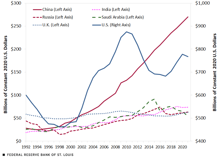
Look at the lines around 2020. China and the U.S. are almost touching. If you didn't dive deeper, you would conclude they're about the same.
Now look at the axes. The left axis (China, Russia, everyone else) goes from $0 to $300 billion. The right axis (U.S. only) goes from $400 to $1,000 billion. I'm not sure why this is even a dual axis, as both are measuring the same thing...
The right axis makes the U.S. line look like it's in the same range as the others, even though it's actually 3-4x higher.
That's the problem with dual y-axis charts. Whoever makes the chart gets to choose both scales. Stretch one, compress the other, and you can choose how trends appear to correlate. The visual relationship is completely manufactured by the scale choices.
The takeaway: When a chart uses two y-axes, the visual relationship is controlled by whoever chose the scales. The visual relationship is completely manufactured by the scale choices.
5. Manipulation by Design
Many of you sent me this chart on Instagram. It's a bar chart posted by Emmanuel Macron showing foreign investment in data centers in 2025, with France leading at $69 billion.
![[object Object]](/_next/image?url=%2Fblogs%2Fmisleading-news-charts%2Fmanipulation-by-design.jpeg&w=3840&q=75&dpl=dpl_DZJ2dWiYUahGpNAVgPXFoje8TdQY)
I'll be honest, at first glance I couldn't figure out what was misleading...
Once you figure it out, you can't unsee it. @AstridQuiTwitte annotated the chart to show the problem.
![[object Object]](/_next/image?url=%2Fblogs%2Fmisleading-news-charts%2Fmanipulation-by-design-anotated.jpeg&w=3840&q=75&dpl=dpl_DZJ2dWiYUahGpNAVgPXFoje8TdQY)
Look at the gridlines. The axis goes from 0 to 70 with labels at every 10. That means there should be 7 evenly spaced gridlines. But count them. There are 8. And they're not evenly spaced.
The gridlines are shifted, squeezed together at the lower end and stretched apart at the higher end.
Your brain uses those gridlines as visual anchors and to understand how big the gaps are. When the gridlines are stretched at the top, France's bar extends further than it should relative to the rest.
This makes the gap between France and the rest look much bigger than it actually is, making this chart disceptively misleading.
Why this all matters
None of these charts contain fake data. That's the uncomfortable part. Every number is real. Every data point is sourced. But the design choices, what to show, where to start the axis, how to scale it, what to leave out, those are the decisions that shape the story.
The next time you see a chart, don't just read the headline it's trying to sell you. Look at the axis. Check the time range. Ask what's missing. If the chart is speaking to you, it's worth asking who wrote the script.