A Better Way to Chart Likert Scale Responses
August 26, 2026 • 2 min read
I can relate to the instinct behind this chart. You want to visualize the results of one survey question so it feels natural to put everything in one chart, but in this case its likely making the results harder to digest.
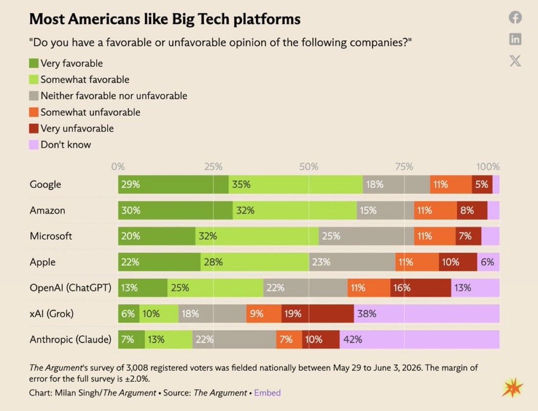
This chart from The Argument how 3,008 registered voters feel about seven major tech companies, with each bar adding up to 100 percent. The chart almost splits into two groups. Respondents have fairly clear opinions about the traditional big tech companies like Google, Amazon, Microsoft, and Apple while the newer AI companies have much larger "don't know" responses.
I think this is where the chart gets a little awkward for me. A 100% stacked bar chart is a good choice for a Likert scale question because responses have a natural order. You can read the bar from favorable on the left, through neutral, to unfavorable on the right.
The problem is that "don't know" is not part of that order but it gets placed after, "very unfavorable" anyway. That unintentionally makes it read like an even more negative response when it really just means that the person does not have enough familiarity with the tech platform to form an opinion.
To fix this I would simply pull out the "don't know" responses out of the stacked bar chart and place it in a separate column right next to the current chart to create that separation between the different measures as illustrated below.
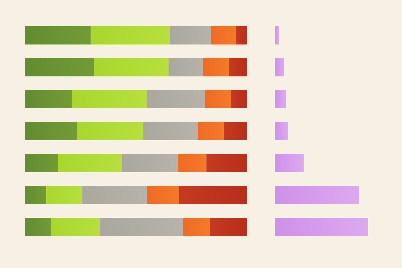
I think breaking it apart this way makes a chart much easier to read. The stacked bars stay focused on how people feel while the purple bars show how many people do not know enough to have an opinion. It is still one survey question but separating the responses makes each part much easier to understand.