Fragging Beautiful
A 3D Look at CS2’s de_dust2 Kill Zones
April 7, 2025 • 3 min read
Credit: @smartbackwards on Reddit
I came across this gem on Reddit and had to share. It’s a visual breakdown of where frags happen on de_dust2 in pro CS2 matches—and it’s a great case study in when 3D does work in data viz.
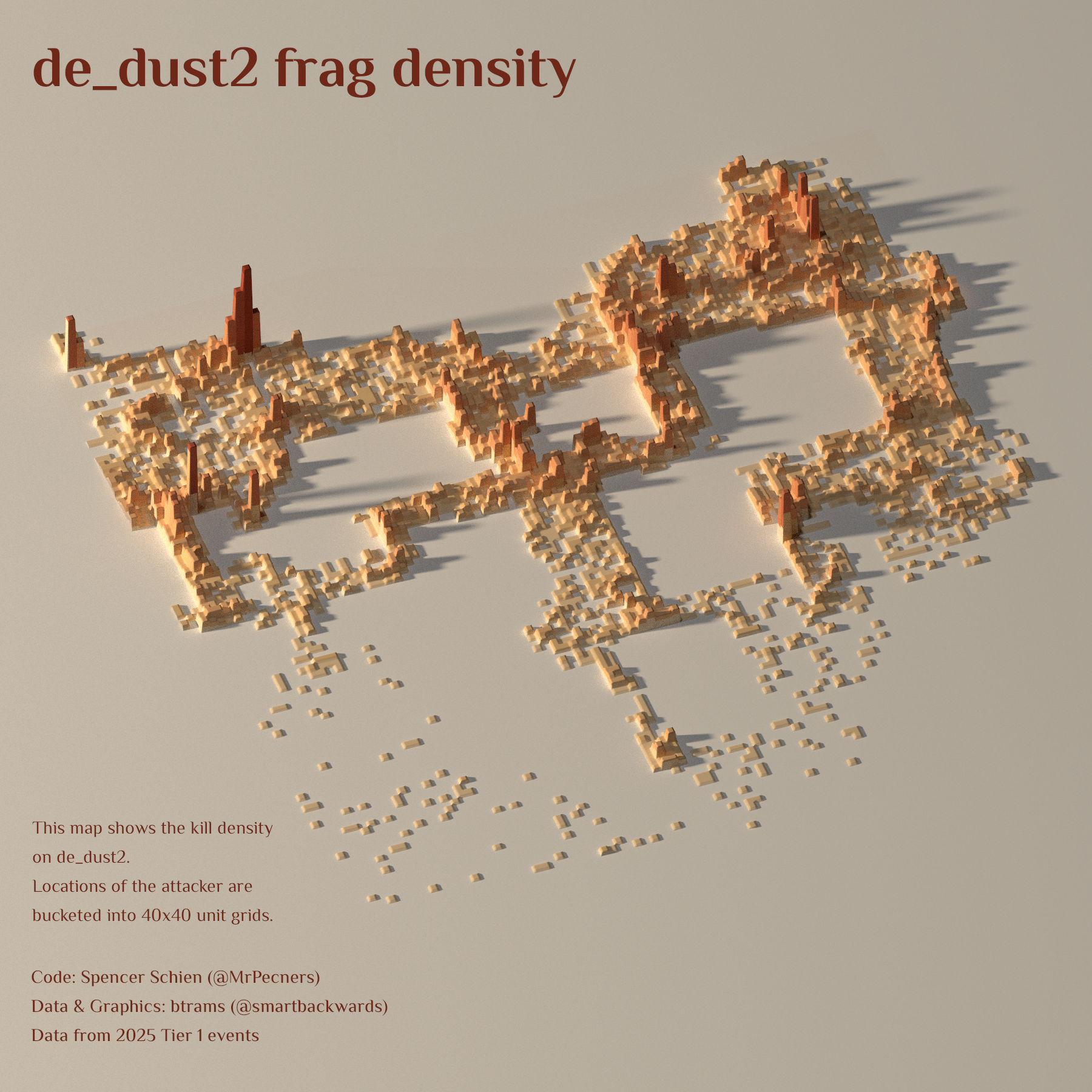
Shoutout to btrams (aka @smartbackwards) for this stunning visualization of frag density in pro CS2 matches on the iconic map de_dust2. The chart shows where players most frequently get kills, using data from 2025 Tier 1 events. Code credit goes to Spencer Schien (@MrPecners), and the whole thing is built on 40x40 unit grids—giving us a blocky yet beautiful heatmap of hot zones.
The map is a 3D histogram, and it’s doing exactly what it needs to: showing us, at a glance, where the action happens. We see clear spikes in classic choke points—Long A, B tunnels, Mid—basically, anywhere your team screams for backup. This isn’t just useful for players and analysts, it’s also a celebration of how games like CS2 create emergent patterns through competitive play.
Now, let’s talk 3D. Normally, I’d scream nooo at 3D charts —depth can distort perception, skew scale, and generally make things harder to interpret. But here? It works. This viz isn’t trying to drive decisions or communicate precise values—it’s meant to be engaging, eye-catching, and a bit of data art. Mission accomplished.
This chart is a great example of data visualization as storytelling. It’s not just about the numbers—it’s about the world they come from. And in the case of CS2, it’s a world defined by choke points, tight angles, and the split-second decisions that make or break a round.