China vs. the World in Solar
Side by Side
September 21, 2025 • 3 min read
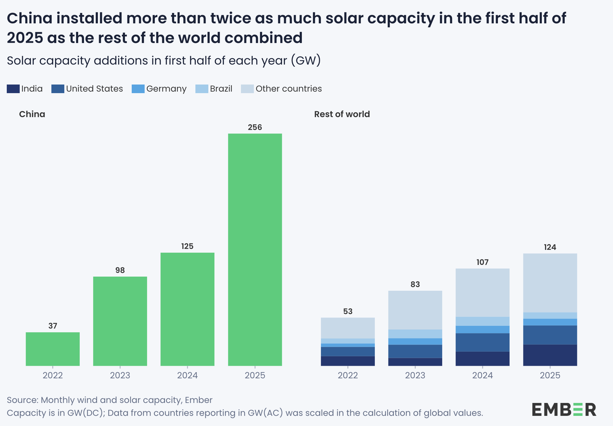
Chart by Ember Energy
China's solar expansion is really highlighted in this chart. In just the first half of 2025, it added 256 GW, more than double what the rest of the world managed combined. That's the headline, and this chart from Ember delivers it with confidence.
First off, those numbers are nuts!
Now, let's focus on the chart itself. The design makes some clear calls. It’s stripped back with just the essentials, light ticks and no gridlines. The numbers do the talking. For Ember’s audience that restraint works. The layout stays quiet so the totals stand out.
What job is this chart doing?
Every chart should pick a job and let the design serve it. Here, the job is comparison: China vs. the rest, year by year.
This goal is evident from the title: "China installed more than twice as much solar capacity in the first half of 2025 as the rest of the world combined"
But the design choice to plot China and the rest of the world separately instead of side by side slows down the very comparison it is built to highlight. The headline promises a head to head, but the bars live far apart. Readers have to scan across the gap and hold numbers in memory just to confirm the point.
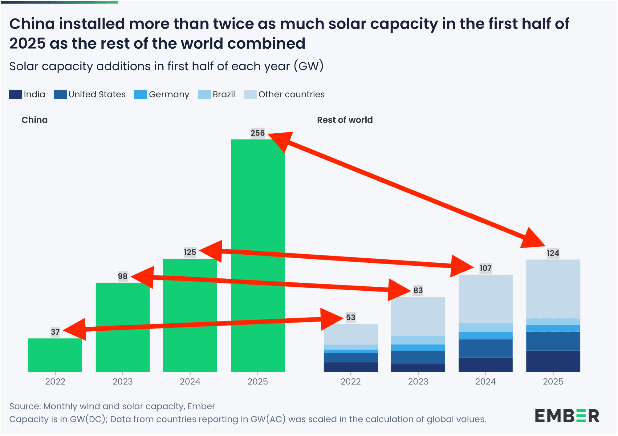
Make the comparison effortless
Keep the minimalism. Change the structure.
For each year, place China and Rest of world next to each other. Center the year label between the pair. Use one shared y-axis. Keep the totals on the bars.
A minor adjustment to a chart that already gets a lot right.
Other jobs charts can do
Comparison isn’t the only job. Charts can carry lots of different kinds of work, and each one sets up a different way of looking at the data. Here's a couple other common jobs:
- Trend (how it moves over time)
- Rank (ordered big to small)
- Part-to-whole (shares, composition)
- Distribution (spread/shape)
- Outlier (what breaks the pattern)
- Relationship (how things move together)
The list is simple, but the mindset is the real trick. Before you draw anything, ask yourself: what job am I hiring this chart to do? If you’re fuzzy on that, your reader will be too.
And honestly, that’s the advice I give myself: don’t chase clever design before the job is nailed. Pick the job, make it obvious, then let the chart deliver. That’s how you keep the story sharp.