When 3D Blocks Hide What Matters
Country Size vs GDP
January 2, 2026 • 5 min read
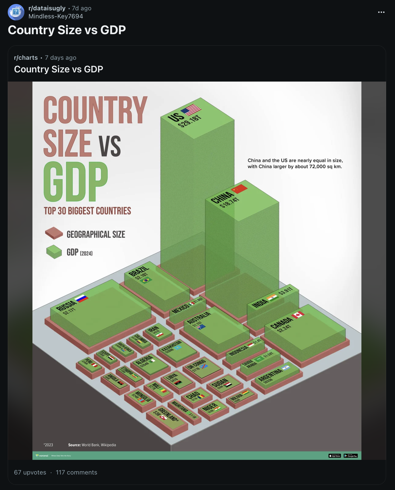
I came across this chart on r/dataisugly. I get it, the 3D isometric blocks are meant to be eye-catching, and there's real ambition here. The visual style has appeal, the color coding is consistent, and someone clearly spent time on this.
The problem with it: Height or volume?
At first I thought GDP was represented by volume. Since it's 3D, I assumed that's what they were going for. Then I looked closer at the numbers on India vs Canada. India's block is taller but skinnier, while Canada's is short but wide. Even though India's GDP is higher, Canada's block feels bigger because of the volume.
The Two Fixes (depending on your goal)
For showing relationship between two variables, use a scatter plot.
Country Size vs GDP
Top 30 largest countries by geographical area
Loading chart...
Source: World Bank, Wikipedia
The scatter plot is a visually easier plot to read. It's easy to spot patterns, outliers, and see the overall relationship between size and GDP. It does, however, have one downside: it's hard to label 30 points without clutter.
In an attempt to fix this, I've added hover tooltips so you can explore each country individually. If your goal is to make sure all 30 countries are easily visible, the 2nd approach works better.
We can instead plot GDP per km² for all 30 countries...
GDP per km²
Top 30 largest countries by area
Loading chart...
Source: World Bank, Wikipedia
This provides a clear ranking of all 30 countries. You can easily see which large countries generate more GDP per km², and the differences between them.
Most of the time 3D is used to catch your attention at the cost of clarity, which isn't worth it.